
Alphabet City
What does a city’s signage tell you about its character?
Lettering is everywhere in the city. Can you imagine a mute metropolis, one without messages? Pictograms, ads, shop signs: the language of signage shapes the face of a city, in the same way food or architecture does. But for how much longer?
When it comes to urban graphic design, Montreal has opted for a muddled path, choosing a very American, eclectic style. Which is totally unlike Berlin's signage, where the typography is always in the imperative mood—official, clearcut, uniform. Schnell! As soon as you get to Buenos Aires, though, the lettering starts to sway, the very image of the music that shakes the city's tanguerías.
That's Philippe Lamarre's reading of it, at least. Lamarre is a designer and the editor-in-chief of Urbania, a themed quarterly
published in Montreal. A lover of graphic vernaculars and a tracker of forgotten signs, Lamarre crisscrossed Berlin, Buenos Aires and Montreal to study graphic design and its pictorial imprint on the cityscape.
"This project was born out of personal interest. When I travel, urban language is as important to me as architecture," Lamarre says. "I wanted to push that idea further, and to see if a city's personality could be read in its typography and the graphic design surrounding it by comparing three different cities."
In 2008, he received the Phyllis-Lambert Design Montréal Grant to compose typographical portraits of Montreal, Buenos Aires and Berlin. UNESCO designated Berlin and Buenos Aires "cities of design" in 2005; Montreal received that title in 2006. The grant has been awarded annually since 2008 to young designers with less than ten years of experience.
One year and three thousand photos later, the results are clear. The three cities, each with distinct graphical personalities, are poles apart—as much on the world map as they are in the world of design.
"No puppy poop in the park," "Caution!" "Work in progress," "School crossing": Berlin's pictogrammes are finely honed—they go straight to the heart of the matter. You can see them from metres away. They're as effective as a German battalion. In Buenos Aires, the undulating letters are embellished with flowers and flourishes.
"There's a graphic force that can be felt in Berlin, where everything is cut-and-dried. The typography is a reflection of the weight of authority. After all, Germany invented Bauhaus and the swastika. In Buenos Aires, the importance of fileteado—a free-flowing and sensual style inspired by the tango—can be felt everywhere, even on the buses," Lamarre says.
In contrast, New York's very pragmatic graphic design doesn't play around. The street signs practically roar, in all caps: "Don't even think of parking here!," "Air will be taken out of tires, license plates removed from unauthorized parkers."
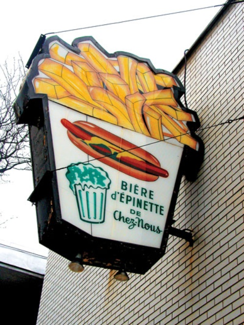
In Montreal, signage is something else entirely. "Montreal's graphic design is more or less in the same style as our urban form. Eclectic, without guidelines, but influenced by American style," Lamarre says.
You can see this eclecticism—graphic Montreal's unique signature—on dépanneur logos, old signs painted on walls and french fry ads awkwardly scribbled with a paintbrush. Unfortunately, Lamarre says, the delightful vintage placards announcing Marché Roger, la Maison du chien chaud and other pearls of the graphic design vernacular are dying out.
"Local typography is less and less present in the city. I was pulling my hair out trying to find the signs that were all over the place when I was a kid. So the goal of this project, then, was to preserve that kind of memory," he says.
In Paris, New York and Hong Kong, as typographical specificity fades away, each city's unique graphic character is taking a beating. Letterers, the consummate craftsmen who once painted signs and did lettering by hand, have disappeared from the cityscape. For example, when the famous Guaranteed Milk water tower on Lucien l'Allier was being renovated last year, it was hard to find a real letterer still in business in Montreal to repaint the sign in the traditional way.
"Whether it's in Paris, New York or Hong Kong, today, commercial lettering is mostly vinyl cut-outs made on computers," Lamarre says. "They're disarmingly banal. It's the Starbucks-and-McDonald's effect applied to urban graphic design."
Lamarre's finds have been put on a website, GraphismeVernaculaire.com, where visitors are invited to add their own and compare the signage in different cities. For example, you'll notice that in Montreal and Berlin, school children definitely have differently shaped heads.
And Lamarre's not the only one to be moved by the fate of old signage. He met two women in Berlin who had started a museum, the Buchstabenmuseum, to preserve local stores' old signs when they close.
In New York, there are even "type walks," in which people can rediscover the Big Apple's typographic face, Lamarre says. These walking tours bring people to "ghost signs"—hundred-year-old signs painted in white on the sides of apartment buildings, often rendered illegible by the elements and the passing of time.
Such phantom signage decorates several sections of Old Montreal and downtown, as well. Even le Devoir's brand new electric sign, recently affixed to the top of the Caron Building, covered up an older logo.
"All of this is going to disappear soon," Lamarre says. "But these signs enrich and define Montreal's landscape, in the same way citizen design-like homemade signs for garage sales and for rooms for rent-does. There are so many hidden jewels."
This article originally appeared in Le Devoir on April 27, 2010. Translation by William M. Burton.
See the rest of Issue 37 (Fall 2010).
Related on maisonneuve.org:
—Urban Poetics: Toronto vs. Vancouver
—Montreal's Gap-Toothed Streets
—I Dream a Highway
Subscribe — Follow Maisy on Twitter — Like Maisy on Facebook