
Interview With Michael Cho
Toronto illustrator Michael Cho chats about his cover for the 25th anniversary edition of Don DeLillo’s White Noise, his relationship with the landmark novel and the renewed literary interest in comics.
Toronto-based illustrator, cartoonist and sometimes writer Michael Cho is renowned in nerdier circles for his distinctive comic book-influenced art. Counting American artists like Jack Kirby and Wally Wood amongst his favourite cartoonists, Cho’s work evokes the pop art of Roy Lichtenstein and aesthetics of Silver and Bronze age superhero comics in equal measure. And as if style alone wasn’t enough to speak to his street cred amongst comic geeks, Cho also maintains a blog dedicated exclusively to doodles and drawings of Iron Man.
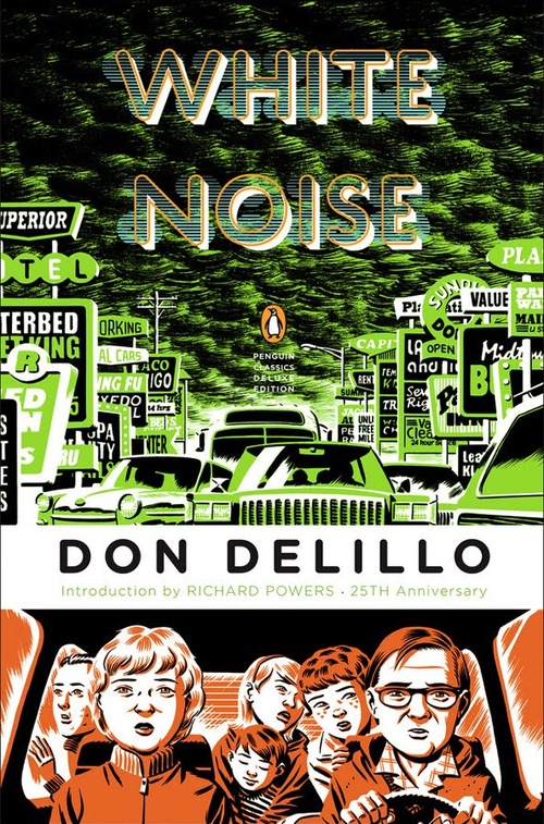
Cho was recently commissioned by Penguin books to design and illustrate the jacket for the forthcoming 25th anniversary edition of Don DeLillo’s landmark novel White Noise. Dealing with everything from media saturation to the fracturing of the American nuclear family to a pill the assuages the natural fear of death and the piddling politics of the academy, White Noise is as much a studied portrait of American culture in the 1980s that still resounds today. Cho’s remarkable new cover design masterfully captures these varied thematic and narrative folds.
Penguin art director Paul Buckley has regularly looked to comic artists and cartoonists to design especially attention-grabbing covers for the Penguin Classics series. Now Cho joins the likes of Tony Millionaire (who designed the cover for Herman Melville’s Moby Dick , Art Spiegelman (who worked on Paul Auster’s New York Trilogy) and fellow Canadian cartoonist/writer Seth (who contributed a very Seth-like Dorothy Parker to the cover of The Portable Dorothy Parker).He provides an in-depth breakdown of his process designing the cover on his blog, Michael Cho’s Sketchbook.
__________________________________________________________________
John Semley: How did the opportunity to the illustrate Penguin’s 25th anniversary edition of White Noise fall into your lap?
Michael Cho: I got an e-mail from Paul Buckley, the art director at Penguin, who told me that they were using comic artists to do covers for a variety of Penguin Classics. In the e-mail he listed the artists who had done work for them, and as I kept reading I thought “I’d love to be a part of this.” Paul told me the book they had in mind for me was White Noise, and I thought “Wow, that’s amazing.”
JS: So you’re a fan of the book?
MC: I read it when I was in my teens. Like nineteen or something. And it was a book that made a big impression on me. It deals with a lot of themes I’m interested in myself: consumerism, contemporary life and the ways it’s impacted by the media surrounding it. That’s a book that’s always resonated with me. When I got the e-mail I was reading DeLillo’s Libra.
JS: Another one of DeLillo’s best novels.
MC: Yeah, but it’s more of a straightforward, historical account of Lee Harvey Oswald, where White Noise is slightly more, well, cool in its sensibility. And apparently, DeLillo had picked me personally. I was told that Penguin had originally picked Robert Crumb to design the White Noise cover, but DeLillo thought he was a wrong fit. Then they pitched him me, and DeLillo thought I was the right guy.
JS: What a compliment!
MC: For sure. I was happy to do it anyways considering that it’s one my favourite books and that I’m happy to be included among the authors who have done these covers. But when I heard that DeLillo had approved me personally, I thought it was fantastic.
JS: Did you speak with DeLillo personally about the design at all, or was the whole thing mediated through the people at Penguin?
MC: It was always through an intermediary. During the course of designing the cover, we went back-and-forth with DeLillo, where he put forward his suggestions and his comments. I incorporated those suggestions into the artwork, and the nice thing was I was given leeway to do what I felt. Because of my respect for him and the book, I wanted to incorporate the suggestions that DeLillo had. But when the cover was assigned to me, they gave me complete freedom with it.
JS: So you were responsible for the illustration and the design?
MC: Everything. They trusted me to do whatever I wanted with it, the only requirements being that I have the author, the title, the Penguin logo and the UPC book. Paul told me that if I wanted to hand letter it, I could hand letter it; if I wanted to do jacket flaps, I could do them; and if I just wanted to do the front cover I could do that. For me, it’s a little different because I’ve worked on book covers before and usually marketing is considered. Usually the marketing department has their own ideas and you have to compensate for that. So I’m used to designing a book cover with the notion that marketing’s trying to appeal to a different demographic, or that sixty percent of the back cover is filled up with pull-quotes. In this case, nothing like that happened to me. I was shocked. It’s like being dropped into the pool and told to make it out on your own.
JS: I suppose with the Penguin Classics, the books themselves are so well-established and canonical that they basically market themselves.
MC: Yeah, it was an ideal situation. Paul told me that marketing does not get involved in the Classics and I was like “what?” [laughs] I’d never heard of that unless it was some self-published book that you print like twenty copies of. At first I was daunted. I was thinking, “Should I pull quotes? Do they have quotes already to put on the back? Do they have copy in mind?” When I got used to the freedom I just had to imagine what, in an ideal world, I’d like to see on the cover.
JS: Was the final fairly close to what you had submitted? What kind of comments did DeLillo offer?
MC: It was fairly close. DeLillo’s suggestions were valid ones, of course, because it is his book. From my rough sketches he thought some of the character designs were a bit off from the written description. It makes sense because he knows these characters, so we went back-and-forth on designs because he had some specific ideas. He had some suggestions about what should be one the flaps. I had chosen eight images and I think we wanted to swap out two or three of them. And I thought that was more than fair. He also had some questions about the quotes I had chosen to pull and why I had chosen them.
JS: What kind of elements from White Noise inspired your take on the cover? Compared to other editions—I remember the edition I first read had an empty playground on the cover—yours is a lot busier.
MC: Yeah, the one with the playground is Paul Buckley design. And I’ve seen that original too, which is just type.
JS: Right, it’s just kind of white font with a drop shadow effect.
MC: Well I try to stay away from looking at other covers when I’m working on projects like this. But I obviously have a memory of them. The reason I chose my images is because the Penguin Classics line covers have a very comic book-y look. They use panels and that. And to me, it was interesting because these artists are interpreting a scene, or doing a bio of the author, in comic form. But at the same time it seems kind of misleading, because I don’t want anyone to think I’m doing a graphic novel adaptation of White Noise. I wanted to try and conform to the comic book, multi-panel look, but I feel the novel itself lends itself to this. The book has multiple layers. Like there will be jingles playing on the radio, or TVs on in the background, and lots of things happening simultaneously.
JS: Jack will be talking to their wife and there’s a TV droning in the other room.
MC: Exactly. And it may be something that’s fitting, but also jarring. There’s these juxtapositions, and I wanted to try and echo that by using multiple panels, which of course also echoes the design of a comic book. I also wanted to have text that read concurrent with these panel that at the same time served as a juxtaposition in some accidentally poetic way. That thing happens a lot within the book itself.
JS: One of the reasons I really like your design is that, well when I read the book I got the sense of this looming sense of fear and death and consumer desire, the “white noise,” but at the same time you’re bombarded with images and sounds and jingles in a way where it’s more than just a backdrop. And I like how on your cover, you have the Gladney family in the car on the bottom and the other cars and billboards and advertisements above them, kind of crushing them.
MC: Yeah, that’s sort of the impact. I wanted these signs to be not completely readable but to have some overall effect.
JS: It’s like a Godard movie where the entire background is billboards, but they’re always framed as cut-off or overlapping so you even can’t read them. It’s more of an environment than an advertisement.
MC: And it’s moving by so fast. I mean the only concern I had was not being too literal and showing everything as it is in a book. That’s something I struggled with. Again, I looked to some of the themes in the book. For example, the back cover is based on a Caspar David Frederick painting. It’s not a literal transcription of it. It’s based on a scene from White Noise but at the same time the composition echoes one of my favourite painters. Caspar David Frederick has sort of a metaphysical and death-obsessed outlook that’s very German. So it fit some of the content of the book. I was trying to evoke again a lot of the postmodern layering of the book itself.
JS: It’s nice because you have the couple, and it’s kind of romantic, but the red sky invokes a lot of the book’s more apocalyptic crisis, like with the Dylar crisis in the second section.
MC: And that’s a scene from the book, where Jack talks to the researcher who’s looking at the Dylar pill and they talk about these great sunsets that occur in their town. I was thinking, well it’d be nice to do that in the style of a Caspar David Frederick painting.
JS: What other projects do you have on the go at the moment?
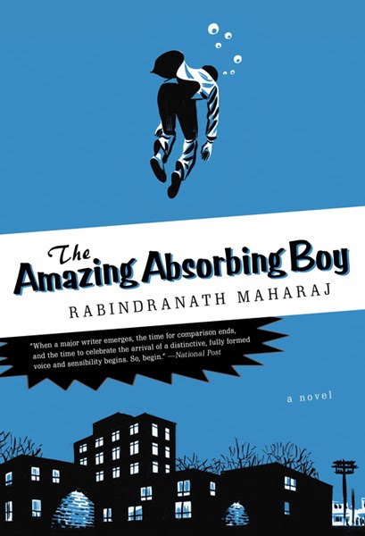 MC: I did another book cover for Random House. It’s a book called The Amazing Absorbing Boy by Rabindranath Maharaj. It’s about a boy who moves from Trinidad to Canada, to Regent Park in Toronto, and the cultural shock of having to assimilate to Canadian life. They contacted me about that because the protagonist in the book has a rich fantasy life, and he grew up reading comic books. And he relates different things in Toronto to comic books. So a subway a tunnel may become where the Mole Man from The Fantastic Four lives. They wanted an illustrator who could draw in a illustrative style but with a comic book feel, as opposed to a comic book artist to do a hardcore superhero cover or something. They also asked me to do twenty interior illustrations, so I did chapter headings.
JS: It seems there’s a new trend in literature, where a lot of younger novelists are writing about comics and comic book culture. I mean there’s Michael Chabon’s Kavalier & Clay, and then Jonathan Lethem’s Fortress of Solitude and Junot Diaz with the Oscar Wao book.
MC: I think Kavalier & Clay set the standard. In the past, I’m talking the ‘40s and ‘50s, if you read comic books, you were considered sub-literate. But as we’ve moved on there’s a lot of adults who are still fans of comics and can ascribe literary value to them. That seems to be happening more and more. I mean, I’m in my thirties, and I grew up reading 1980’s Marvel Comics. And I’m part of a generation where there’s hundreds of thousands of us, in all walks of life, who have this kind of nostalgic relationship.
JS: It’s nice to see someone like Lethem who feels comfortable moving between writing comics and literature rather effortlessly. And of course there’s the whole trend in the “graphic novel” becoming a medium that is accepted more and more as a legitimate form of art and storytelling.
MC: I definitely see the graphic novel thing happening more and more. I used to do children’s books, and I noticed that over the last five years or so libraries and school teachers have become more accepting to the ideas of children reading comic books. So you have people like Dalton McGuinty saying that it’s okay for kids to read comics, because at least they’re reading. I’ve seen a bunch of publishers who in the past published children’s books try and tackle the graphic novel because it’s one of the ways they can retain the “reluctant readers.” So I started getting calls to work on books aimed at grade five readers.
JS: It’s an interesting argument. I remember the same thing when I was in middle school and everyone was defending the Harry Potter books in a similar way. I mean, the “at least they’re getting kids to read” line. But know I know 25 year olds who still read nothing but Harry Potter.
MC: Yeah, but at least they’re reading something! [laughs]
Jon Semley is a contributing editor at Maisonneuve. Read "Generation Geek," his report on nerd culture and the FanExpo convention.