A Peek at Maisonneuve's Cover-Design Process
How do our covers wind up looking the way they do? Here's a quick look at a few ideas that didn't make the cut.
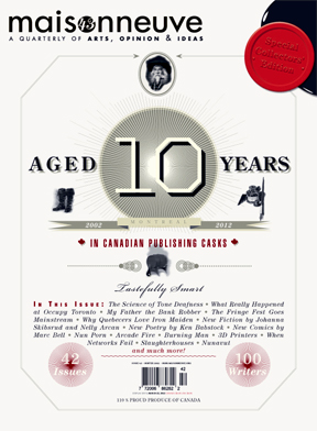
For our tenth anniversary issue, our art director Anna Minzhulina designed a simple, classic cover. Note the logo in the "10," the strong cover lines and the corner slash:

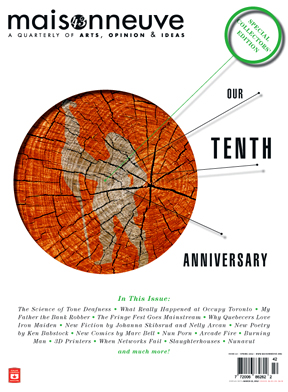
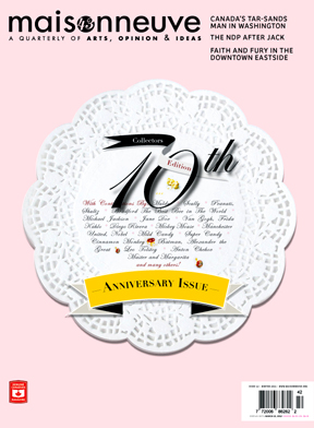
But she also brainstormed plenty of other ideas. (Please note that all cover mock-ups in this post may include placeholder, non-final text.) Here are a few. One is intended to look like a liquor label; another is composed of the ingredients of a half-finished birthday cake; the third uses tree rings to represent our growth; and the final also plays on the birthday theme:

Our Winter 2011 cover story was a big investigative feature on collusion and violence in the Montreal snow-removal industry. We wanted to make the cover text-heavy and really push the story. Here's the final cover, with an illustration by Victor Kerlow that plays on the iconic Tiananmen Square photograph:

Now, here are some of Anna's mock-ups, featuring other illustration ideas:

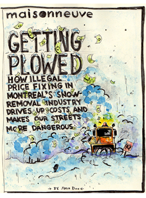
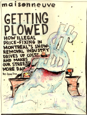
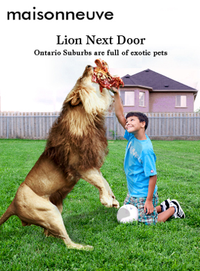
Our Fall 2011 cover story was a look inside the secretive world of Canada's exotic-animal trade, and the cover featured a big, bold image of a tiger staring directly into the camera, wearing a collar that reads, "Mr. Cuddles":
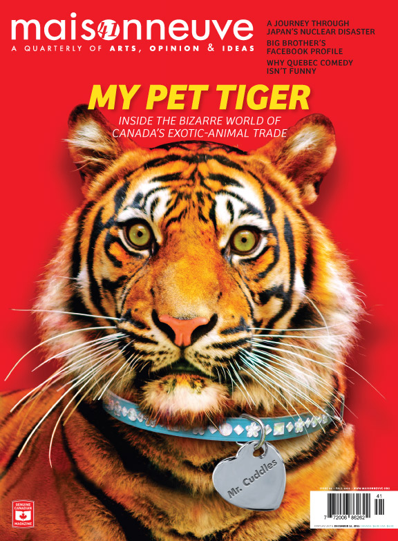
The idea was to contrast the ferocity of the animal with the cheesy domesticity of pet ownership. One of Anna's other ideas played on the same theme, but set the scene in the backyard instead:
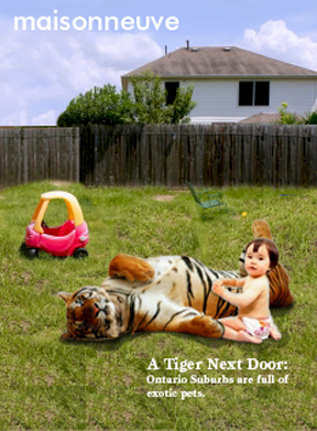
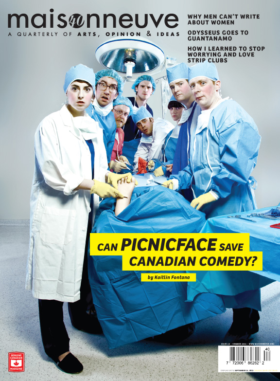
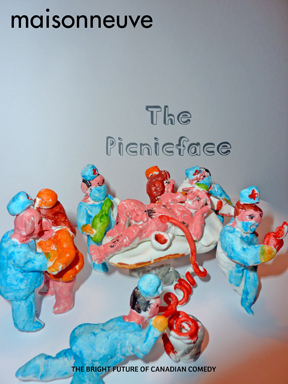
Finally, our Summer 2011 cover story was a profile of the up-and-coming Canadian comedy group Picnicface. Here's the final cover, photographed by Aaron McKenzie Fraser. We set it in a hospital, to play on the theme of Picnicface "saving" Canadian comedy:
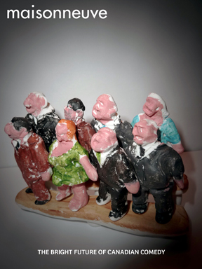
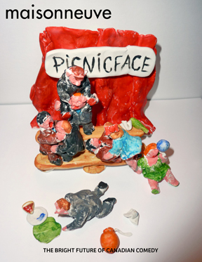
This time, Anna really went all-out in her mock-ups: she assembled little plasticine dioramas of the group. Two of them were supposed to represent a "class photo," which was our other main cover concept, while the third is a rather more lurid version of the hospital concept:
Curious about what our next cover will be? You'll just have to wait until June to find out.
Subscribe to Maisonneuve today.
Related on maisonneuve.org:
—Our Tenth Anniversary Issue
—Photos: "Knights of Griffintown" Outtakes
—Getting Plowed


