Ode to an Eyesore: The Transformation of the Vancouver Eaton's Building
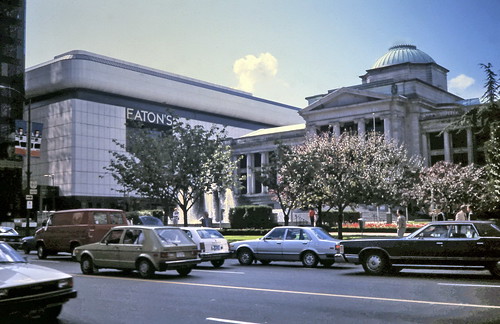
Eaton’s in 1984. Photo by Gregory Melle
Columnist Alan Fotheringham called it an “unending urinal wall.” That somehow filtered down to the Vancouver population as “the upside-down urinal” or the “great white urinal.” But the name-calling won’t last for much longer. Next year, the great white windowless box that dominates the corner of Robson and Granville will celebrate its 40th anniversary with a dramatic makeover for Nordstrom, its new tenant.
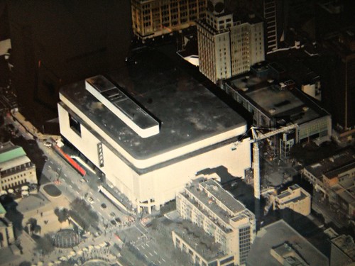
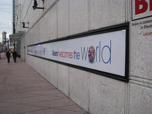
The box was built in 1973 for Eaton’s, the now-defunct department store chain, and it was designed by César Pelli, an architect known otherwise for corporate skyscrapers like the Petronas Towers in Kuala Lumpur and One Canada Square in London. Its façade consists on large white marble panels and, to some extent, it really does look like the tile backsplash of some department store washroom.
There are plenty of reasons why it looks the way it does. Eaton’s was built as part of Pacific Centre, a large mall whose sentiment is suburban even if its location is not. Department stores at the time followed a strategy of making their stores difficult to navigate in order to trap customers, so it’s likely Eaton’s requested that the store have no windows. Pelli would have been happy to oblige, since he’s an awfully obliging architect — I mean, just look at his buildings. They aren’t exactly monuments to innovation.
Still, I’ve always had a soft spot for the white box. Its minimalism is clumsy and its presence is brutish. In other words, it is everything that Vancouver is not, so its overbearing, featureless presence serves as a nice foil to the glassy, earnestly humane architecture that surrounds it. Vancouver is “nice.” This building is not. Its obstinance is almost refreshing.
Robson and Howe in 2008. Photo by Johnny Firebird
The box from above. Photo by Darrell
The building’s Robson Street frontage. Photo by James Sherrett
It’s interesting to note, then, that the transformation of the old Eaton’s building will be undertaken by an architect many might consider the César Pelli of Vancouver: a prolific commercial architect who, in the words of critic Trevor Boddy, “goes as far as his clients will let him.”
When people refer to Vancouver as the “City of Glass,” and talk about its skinny apartment towers that sit on townhouse podiums, they are referring (usually unknowingly) to the legacy of James Cheng. Born in Hong Kong in 1947, Cheng has lived and worked in Vancouver for 40 years. In the late 1980s, he pioneered the townhouse podium tower typology that came to be associated with Vancouver urbanism; Downtown Vancouver looks the way it does because of Cheng.
The problem is that his innovation was enshrined by planning codes and copied extensively by other architects and cut-rate developers who dumbed down the concept and used cheap materials. If you manage to separate the wheat from the chaff — all the knock-offs from Cheng’s real thing — you’ll see that Cheng’s buildings are actually quite well-executed. They may be erected by profit-hungry property developers, but they have good scale, lush landscaping and a thoughtful relation to the street. It’s not attention-grabbing, eye-popping architecture, but it’s a good urban baseline for a small town suddenly turned big.


I spoke with Cheng last week for a story that will be published next month. The conversation turned to the Nordstrom project, which was announced on September 17. If you glance at the renderings, the makeover looks very Vancouver — very Cheng. The white panels are gone, replaced by big transparent panes of glass and brushed concrete. A building long considered Vancouver’s biggest eyesore now seems to disappear apologetically into its surroundings.
But Cheng sees himself more as an urbanist than as an architect, and beyond the aesthetic changes he will make to the old Eaton’s, it’s the way he plans to open it up to the city that will make the biggest difference. When Cheng was an intern at Arthur Erickson‘s office in the early 1970s, one of the first projects he worked on was Robson Square, the sunken plaza across the street from Eaton’s.
“It was meant to be like a central square, but Eaton’s was a problem from the start because it was such a monolith,” he recalled. This time around, Cheng was determined to fix the problem. “I spent a lot of time walking the streets around it, trying to understand its relationship to the city and how people move around the site,” he said. He decided to make the ground floor as “transparent as possible,” not only by enlarging entryways, but by eliminating as many fire exits and service doors as he could.
Nordstrom will only take up three of the building’s seven floors, so the upper floors will be converted into office space with extremely large floorplates to attract the kind of tech firms that have fled to suburban office parks; Cheng will punch two atriums into the building to make sure nobody inside is more than 40 feet away from natural light. Nordstrom will have plenty of natural light, too, though Cheng said it took awhile to convince them that windows were preferable to blank walls.
Perhaps the biggest surprise of the project is the way it references another building just up the street, the former main branch of the Vancouver Public Library, a demure High Modern structure built in 1957 and designed by Harold Semmens and Doug Simpson. Since the old Eaton’s is located halfway between the old library and the new library, a Coliseum-like postmodern structure designed by Moshe Safdie and opened in 1995, “I wanted to reflect this historical continuum,” Cheng told me.

Cheng was actually the architect who turned the old library into a retail complex back in the mid-90s. “I came to really have a respect for the architects — they had a sense of the modern scale that is different to the current crop of architects. The current crop likes big forms, whatever the computer can generate. But these people from the mid-century have a really humble sense of modernist scale. They were the first ones to have vertical shading that rotates with the sun, and then they have overhangs that respond to the Pacific Northwest rain. We applied a lot of what we learned from that renovation [to Nordstrom].”
It’s likely that most people in Vancouver will be relieved to see the demise of the great urinal wall. Cheng’s design will certainly make for a better streetscape. But there’s still a part of me — reflected by this thread on Reddit, which is quite critical of the redesign — that will miss the odd white cube that had the effrontery to go against everything Vancouver stands for.
From Urban Photo. Follow DeWolf on Twitter.
Subscribe to Maisonneuve today.
Related on maisonneuve.org:
—Drawn and Quartered
—Another Montreal: Special Tours for the Indifferent Traveller
—Montreal's Navarino Cafe: A Love Letter


