
Mapping Assumptions: Flipping the Global Perspective
There’s a classic episode of The West Wing about an annual White House tradition wherein aides have to spend a day humouring various eccentric interest groups that want to petition the President about something. At first, the staffers can’t stand babysitting all these hyper-earnest weirdos, but the cynical speechwriters and policy wonks are all eventually persuaded that the petitioners might be on to something.
C.J., the press secretary, ends up in charge of Cartographers For Social Justice. Their hobbyhorse is that the standard world map distorts our view of the planet to the detriment of the global South by, among other things, making Africa seem smaller and more marginal than it really is. C.J. rolls her eyes through their impassioned spiel, exasperated with the tediousness of the whole humour-an-interest-group-for-a-day concept. But then the cartographers produce their big reveal: an upside down map that accurately reflects the size of various countries. (Algeria, for example, correctly appears much bigger than Greenland.) C.J. is floored—she starts evangelizing about the upside-down map to everyone who’ll listen. Why do we print maps with Europe on top of Africa, anyway?, she starts wondering. Against the vast backdrop of outer space, after all, planet Earth doesn’t have a right side up.
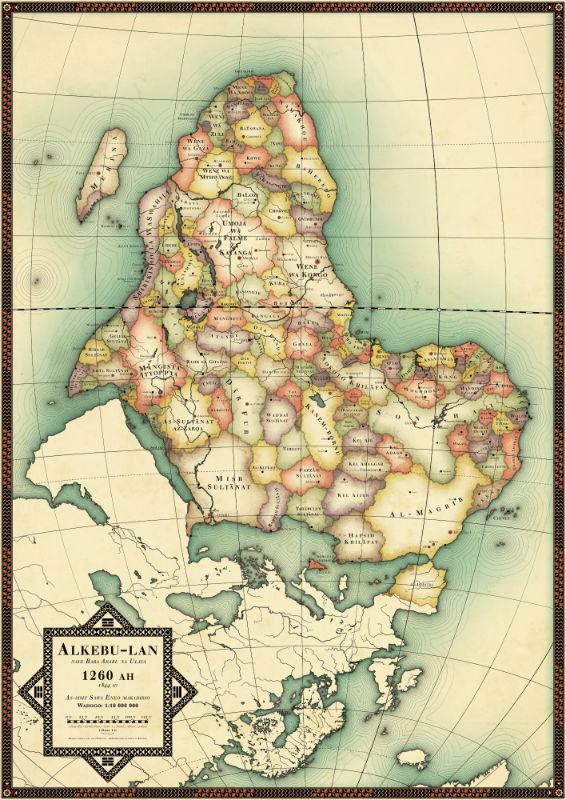
I was reminded of C.J.’s road-to-Damascus moment by a map that the Algerian-British journalist Naila Missous tweeted out on Saturday. What’s supposed to be so interesting about the map is that it’s broken down into the territories that divided Africa before European colonial powers redrew the continent’s borders. But what struck me about it was its orientation: the Cape of Good Hope is at the top. Modern-day Morocco flows down across the Straight of Gibraltar like sand in an hourglass. Italy is pointing up, instead of jutting down. It looks all wrong!
Obviously it’s no more right or wrong than the standard map of the world. But my powerful sense of disequilibrium at the sight of Africa towering over a flattened and cowed-looking Europe suggests that the Cartographers for Social Justice may have had a point: it seems like the position of countries on a map really does shape our unconscious attitudes about them. The typical world map makes Africa and South America look like appendages of Europe and North America, dangling limply in the direction of the South Pole, grasping the northerly continents like the edge of a cliff. On the “inverted” map, the Arabian peninsula seems to be decanting Turkey, while continental Europe looks like something squashed under Africa’s Mediterranean pillow. The "global South" looks dominant.
This isn’t to say that the inequalities between Europe and Africa would be magically redressed by flipping the map on its head. But wouldn’t it be fun to see what would happen if we did it anyway?
