Weep for the ROM

Weep for the ROM. It was great once. Now it’s unbearably bad, ruined by a brilliant newspaper editor and his pet architect (also brilliant, also ruinous).
By “ROM” I mean Toronto’s Royal Ontario Museum, the venerable hybrid—part natural history museum, part repository of civilizations, part shell of its former self—celebrating its one-hundredth anniversary on March 19, 2014. There isn’t much to celebrate: after a disastrous renovation that finally ended in 2011, the museum is hard to navigate, structurally incoherent, ugly and stripped of the mystique and grandeur that once made it such a magical place.
If the museum is limping to its centenary, it was lamed by its own hand. In 2002, then-director William Thorsell—formerly editor-in-chief of the Globe and Mail—began what he called the “Renaissance ROM” project. It was supposed to drag a musty relic into the twenty-first century; by 2011, when the self-flagellation finally ended with the unveiling of new third-floor galleries, it had cost $416-million and scarred the institution it was supposed to save.
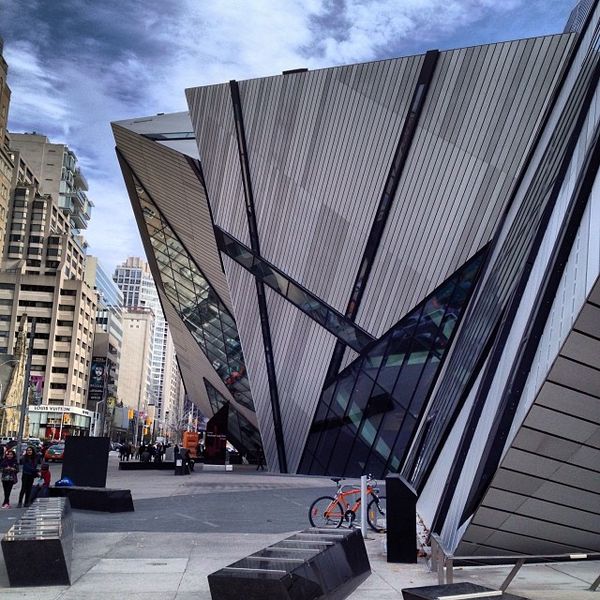
The damage began with the architect who famously first sketched his daring vision for the building on a napkin. Daniel Liebskind’s big idea was for a “crystal” to jut out of the museum’s Bloor St. façade like a precious mineral leaping out of a rock. It was a tidy metaphor for what artist and director thought they were doing to the museum as a whole. But cost overruns forced the Michael Lee-Chin Crystal—so named for the project’s benefactor—to be built not with glass, as Liebskind intended, but with a kind of matte, chrome-like material such as you find on high-end modern refrigerators. It was a debacle. And yet, dramatically looming over Bloor St. and visible for miles, it remains the least awful part of the overhaul.
To experience the full horror of what Thorsell wrought, you have only to walk through the main entrance. The front door is now nestled under an imposing shard of Liebskind’s crystal, and leads into a cramped foyer whose flimsy-looking walls seem to be made of plywood. The paint job in this room appears unfinished: splotches of cream mar the white and streaks of dirt and fingerprints are visible everywhere. Before the renovation, you passed through heavy wooden doors on Queen’s Park, set in elaborately carved stone and flanked on either side by Chinese lion sculptures from the seventeenth century. Then you stepped into a soaring, domed atrium, whose ceiling is covered in a golden mosaic. The church-like majesty of that entrance filled me with awe as a child; now the space is used as a reception area for special events and has always been empty when I’ve visited.
The new entrance has other problems besides its dumpy appearance—namely that it causes the visitor to get lost. Beginning at the old atrium, the museum used to spread out symmetrically before you: grand staircases whose stone banisters were cold to the touch lay to the left and right; a vast hall with parquet floors and murals of jousting knights lay straight ahead. Now, you enter from the side, so that the exhibits are scattered all around in no logical sequence.
When you’ve oriented yourself, the route to any given destination tends to go through a long and confusing series of depressing bleach-white stairways lit with fluorescent tubes and reminiscent of the unfrequented, eerily quiet flights of stairs in forty-story condos where everyone uses the elevator.
The shabbiness and incoherence extends to every aspect of Thorsell’s ROM. The dinosaur exhibit, once washed in dim, spooky lighting and set against evocative forest scenes, is now bright and antiseptic, with kill-joy illustrations showing just how little of the towering skeletons are made from authentic bone as opposed to plaster moulds.
The big new exhibition hall is in the basement, where you would expect to find furnaces and storage space. The cafeteria is weirdly cavernous, a huge, yawning waste of space. The whole makeover is a complete botch job from start to finish.
It didn’t have to be this way; there’s nothing inherently wrong with sprucing up old-fashioned museums. Frank Gehry’s gorgeous renovation of The Art Gallery of Ontario, completed in 2008, is no less radical than Leibskind’s ROM. The two new buildings were supposed to announce Toronto’s arrival as a “great city,” to usher it into the future. Only one did. The other thumbed its nose at the past and wound up desecrating a hundred years of history. Happy birthday.


