Welcome to Maisonneuve 2.0
Redesign reflects a renewed energy at the magazine
Anyone who has known this magazine for longer than the present issue will notice something has changed. Did Maisonneuve get a haircut? In a word, yes—a bold new look. A whole new wardrobe, in fact. After thirty issues, we felt some fresh threads were in order.
Our look, up until now, has been stellar. Any previous desire for a redesign got If it ain’t broke, don’t fix it in response. But over the past seven years, some elements in the magazine have broken down—or rather, shown their limitations. Things like the effectiveness of section title information, the role, size and placement of captions, the number of words per page, our presentation of author biographical information, and perhaps the biggest issue, our cover, our logo and its tag, “eclectic curiosity.”
I’ll let you in on a little secret: no one actually knows what eclectic curiosity means. It’s a redundancy wrapped in an enigma wrapped in bacon. A cute, finger-food phrase—something perky-sounding that may or may not contain real substance, all held together by a wooden toothpick. In my defense, I love bacon, which may explain why we’ve kept it around this long.
But curiosity is, by definition, eclectic. And all magazines are relentlessly eclectic within their field. So saying our magazine is eclectic and curious is like saying—well, if Maisonneuve were a restaurant, it would be like putting “Lively Chewing” on our awning.
So, out with the mastication and in with the far more informative arts, opinion and ideas. This useful triad was, in fact, our original tag on our first two issues.
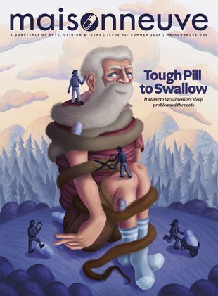
We’ve also made the logo smaller and thicker. Maisonneuve is a long, conceptual word but now, thanks to art director Anna Minzhulina, it is easier to read, has greater visual impact, and is better interpreted by its tag. The extra top space also lets us promote more stories higher up.
Inspiration for the new cover look came from archive magazines of the 1930s and 40s (Time, Esquire, Fortune) fused with contemporary aspects of The Economist, Monocle, The Believer and Rolling Stone. Throughout the process, which sometimes found us a long way out in the design wilderness, we tried to work in the bold spirit of Adbusters, confident that we could create something really fresh and transform that sense of adventure into lines and grids, and that readers would share our excitement.
The result of these changes is a text-friendly cover that doesn’t need a cover wrap to sell stories, and which no longer hides its style and brightness under a bushel. We’ve always aimed for visually arresting, witty covers, and these changes should show that effort more clearly.
Our interior page design retains its classic two- and three-column grid, but the new border unifies it with the cover look, highlights section titles through great use of negative space, and even allows us to increase words per page slightly, without feeling cramped. These changes enhance the “arts mag” feeling of the reading experience. This is a conscious move away from newsweekly design elements, in favour of a greater “uniqueness” factor.
New fonts—Bree for heads, Warnock for decks—complement our ongoing use of Esprit Book as a body font. We think readers will come to see the essential seriousness that underlies Bree’s dipsy-doodle surface. Serious-yet-playful Bree is an accurate reflection of this magazine’s spirit. And what’s a redesign without a new website? For the past nine months, behind the scenes, we’ve put maisonneuve.org through the same paces as our print edition. By the time you read this, the sparkling results will have gone live.
With this look, we hope to re-strike the balance of Maisonneuve’s arts magazine impulse (front-line creative writing and art, intellectually challenging nonfiction) and its popular, broader-base qualities (timeliness, a sense of humour, wide accessibly). We’d love to know what you think of our efforts—and how many gift subscriptions you’d like to order.


